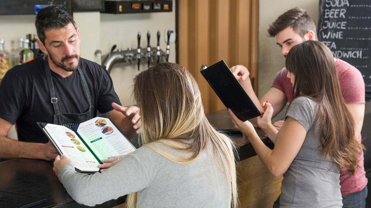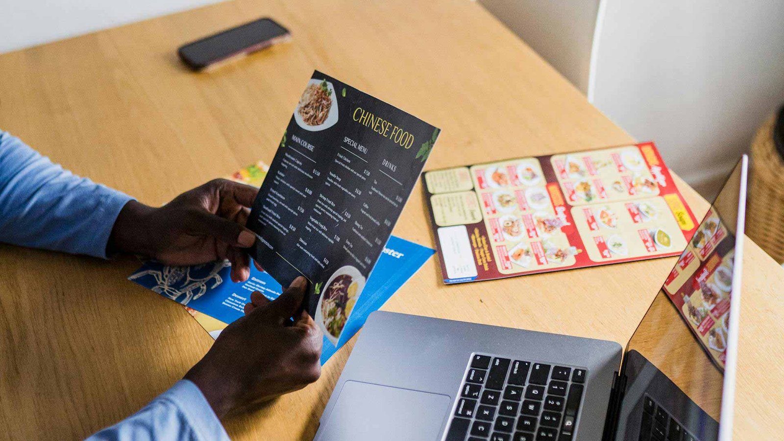
If you’ve ever watched a guest scan a menu, you’ll notice something fascinating: they don’t actually read it. They skim. They float. They land on whatever feels easy, familiar, or visually pleasing. And in that tiny dance of the eyes, sales are made or lost.
Most restaurants focus on adding new dishes, improving food costs, or changing pricing. But very few pay attention to a silent powerhouse that influences every sale that leaves the kitchen: where items are placed on the menu.
This is where menu placement strategy comes in and why restaurants that use it consistently see increases in revenue without raising prices, adding more staff, or reinventing their entire concept.
Today, we’ll walk through how menu layout affects revenue, the psychology behind item placement, and how you can optimize your menu to increase sales. And yes, we’ll encourage you to grab some free resources from ERC to make this even easier.
Why Menu Placement Matters More Than You Think
Menu placement isn’t about making things look pretty. It’s about guiding the guest’s attention so they naturally gravitate toward the dishes that are:
- Most profitable
- Best aligned with your concept
- Most consistent to produce
- Most loved by guests
When used properly, menu placement becomes one of the highest-ROI tools in restaurant marketing. It’s like setting up a path through a forest: people will follow it if you design it well.
Many Canadian restaurants unknowingly put their hero dishes in “dead zones,” price the menu like a mathematical grid, or list their most profitable items where guests rarely look first. The result? Guests choose at random, leaving money on the table, literally.

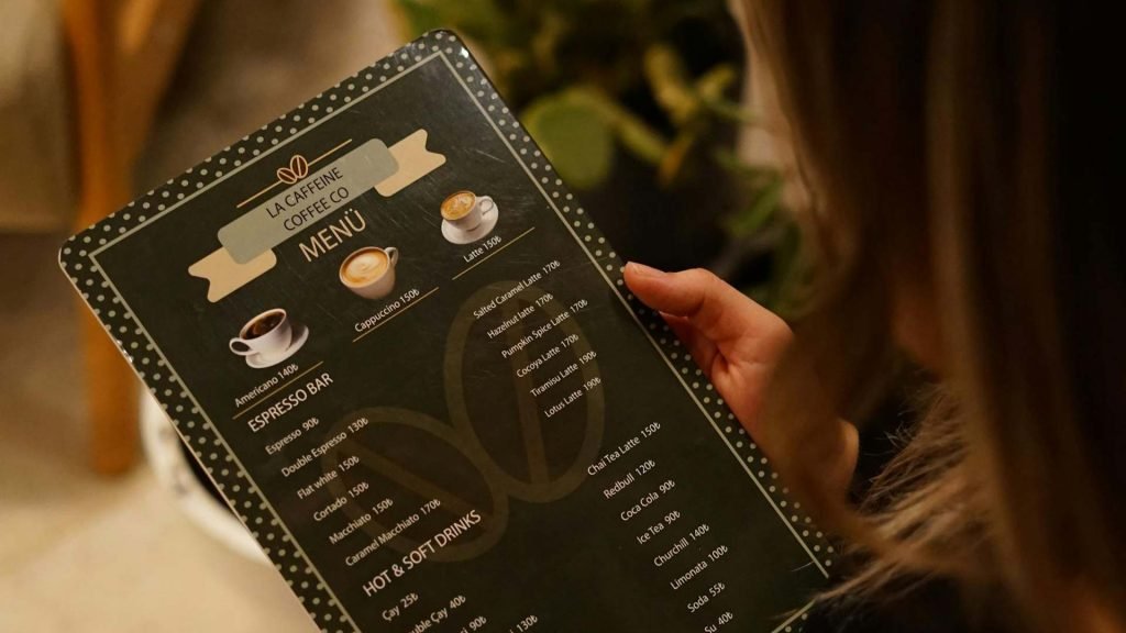
How Guests Read Menus (And Why It Matters)
Guests rarely read menus line by line. Instead, they skim, scan, and land on certain areas almost instinctively. Understanding these patterns is the first step in menu optimization.
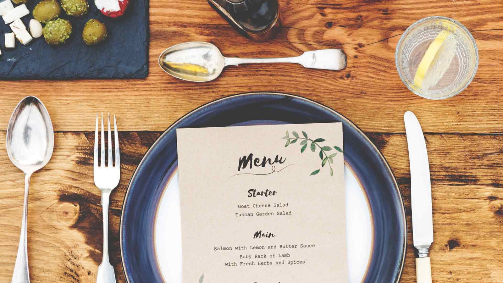
- Golden Triangle: On traditional printed menus, diners’ eyes usually focus on the top right, top left, and center. Items placed here get noticed first.
- Digital scrolling: On screens, the first third of the menu gets the most attention. Middle items may be skipped, and bottom items receive minimal attention.
- Visual anchors: Bold text, boxes, icons, or photos draw attention, but should be used sparingly. Overusing these cues dilutes their impact.
The takeaway: Menu psychology isn’t fluffy theory. It’s a predictable, proven behaviour pattern. When you place items strategically, guests essentially “choose themselves into” your profitability structure.
The Psychology Behind Menu Placement
Menu design isn’t just about visuals; it’s psychology. Diners make decisions based on comfort, clarity, and perceived value. A clean, well-structured menu reduces confusion and decision fatigue, encouraging guests to order confidently.
- Highlighting top dishes subtly signals quality and recommendation.
- Clear, concise descriptions increase perceived value and reduce ordering hesitation.
- Avoid overloading the menu with too many choices, which can overwhelm guests and lead to conservative ordering.
In short: Clarity, confidence, and visual hierarchy = higher revenue.
The Power of Strategic Menu Placement
Menu placement is one of the most overlooked ways to increase restaurant revenue without raising prices. When the layout flows intuitively, guests make decisions faster, gravitate toward your profitable dishes, and feel more confident about what they’re ordering.
When it’s poorly designed, people hesitate, skim randomly, and often settle for cheaper or familiar items. Strategic design gently guides diners where you want them to look. Let’s break down the fundamental revenue drivers behind clever menu placement.
1. Anchor the Menu With High-Profit Items
Anchors are the dishes that act as your menu’s “starting points.” These are placed in high-attention zones so guests instantly land on the items you want them to consider first. When guests see something appealing and profitable right away, they stop wandering and start choosing with confidence.
Examples include:
- Your best-selling, low-cost pasta
- A signature pizza with excellent margins
- A chef-inspired dish that represents your brand
Anchors calm decision fatigue. They instantly give guests something to lock onto, and that little sense of direction helps guide the rest of their choices. Without them, diners drift around the menu and often default to the least expensive option. Anchors align their eyes, and your revenue.
TL;DR: Place your star profit-makers in the first places guests look, so they start choosing instead of wandering.

2. Box, Highlight, or Separate Your Hero Items
Highlighting works the best! Visually separated items consistently get chosen more. A simple box, shaded background, or extra spacing is enough to make a dish feel like a “house favourite” or chef recommendation. Diners naturally gravitate toward anything that looks curated or special.
But moderation is everything:
- One highlight per category
- Keep the design clean
- Let your strongest dishes carry the spotlight
Too many boxes or icons create noise. When everything screams for attention, nothing stands out. A single, intentional highlight communicates confidence: This is the one you should notice.
TL;DR: Use one highlight per section to draw attention to your most profitable dishes. Subtle signals convert best.
3. De-emphasize Low-Profit Items Without Removing Them
Many dishes like kids’ meals, basic sides, and low-margin breakfasts are necessary but not profitable. They should still be on the menu, but they shouldn’t steal attention from your winners. This is where soft de-emphasis techniques come in.
Use strategies like:
- Lower placement in a section
- No bold text or photos
- Shorter descriptions
- Smaller font size
This gently nudges guests away from items that don’t move your bottom line, while still keeping the menu inclusive and accessible. It’s all about guiding attention.
TL;DR: Quietly downplay low-margin dishes so guests naturally drift toward better revenue drivers.
4. Use Descriptions That Sell Without Overwhelming
A good menu description is warm, clear, and confidence-boosting. It gives guests a reason to choose the dish without drowning them in adjectives or fluff. Canadians especially appreciate clean, straightforward descriptions that still evoke flavour and experience.
Great descriptions:
- Set the scene
- Communicate texture or aroma
- Share a tiny micro-story
- Boost trust in the dish
Avoid jargon and overly poetic language. Focus on simple, evocative phrases that help diners imagine the dish.
Avoid: “Hand-crafted artisanal organic farm-to-table pizza perfection.”
Use: “Stone-baked, thin-crust pizza topped with fresh basil and creamy mozzarella – a guest favourite.”
Good descriptions build appetite, but they should always feel effortless.
TL;DR: Write simple, sensory descriptions that help guests feel confident about what they order.
5. Place High-Margin Items at the Top of Each Section
People often pick the first appealing thing they see. That makes the top of each category some of the most valuable real estate on your entire menu. Putting your best-margin items in those top positions increases visibility and immediately boosts ordering probability.
Examples:
- First two pastas → your highest margin
- First breakfast item → your strongest seller
- First appetizer → the dish your kitchen executes flawlessly
Diners rarely read entire sections. They scan until something “feels right,” and your top-listed dishes become their default choices. This is one of the simplest placement changes with the most significant, fastest impact.
TL;DR: Put your most profitable dishes at the top of every section; the first spot gets the first sale.
Common Mistakes in Canadian Menus
Many restaurants unintentionally lose revenue through menu design mistakes:
- Hiding best-sellers in low-visibility spots
- Overcrowding categories
- Using too many photos or distracting visuals
- Poor hierarchy and inconsistent fonts
- Long, unclear, or flowery descriptions
- Misaligned prices that encourage comparison
Fixing these issues can immediately improve guest choices and average spend.
Quick tip: Small adjustments in placement and hierarchy often outperform new menu items or marketing campaigns.
The Benefits of Optimized Menu Placement
Menu placement isn’t just about revenue. A well-designed menu improves the overall guest experience:
- Guests feel confident and less overwhelmed
- Decision-making is faster, reducing server queries
- Average check increases naturally
- Repeat visits are encouraged through positive experience
A good menu creates harmony between the guest, the server, and the kitchen and it quietly drives sales behind the scenes.
How ERC Can Help
You don’t have to guess or experiment blindly. ERC offers free tools and resources that simplify menu optimization for Canadian restaurants:
- Templates for eye-tracking zones and placement strategies
- Profitability audits to identify top-performing dishes
- Category organization guidance
- Step-by-step restructuring worksheets
Download free resources here: https://erestaurantconsulting.nextwebly.com/free-resources/
If you’re ready to maximize the revenue potential of your menu, ERC also offers free consultations. An expert will help you review your current menu, identify opportunities, and implement changes that deliver measurable results.
Book your free consultation today and turn your menu into a silent sales engine.
Conclusion
Thoughtful menu placement is a subtle, high-impact tool that guides guests naturally toward profitable and signature items, improves their experience, and increases your bottom line. Minor adjustments, strategic highlighting, and clear, concise descriptions can transform your menu from a passive list into an active sales driver.